Typography allows designers to communicate effectively with their target audience. Being able to select the most optimal font for design work is therefore very important. I spent some time exploring best practices for working with typography; I created a series of mood/font demos, a type specimen poster, and a business identity system for Latha Luxuries.
Mood/Font Demos
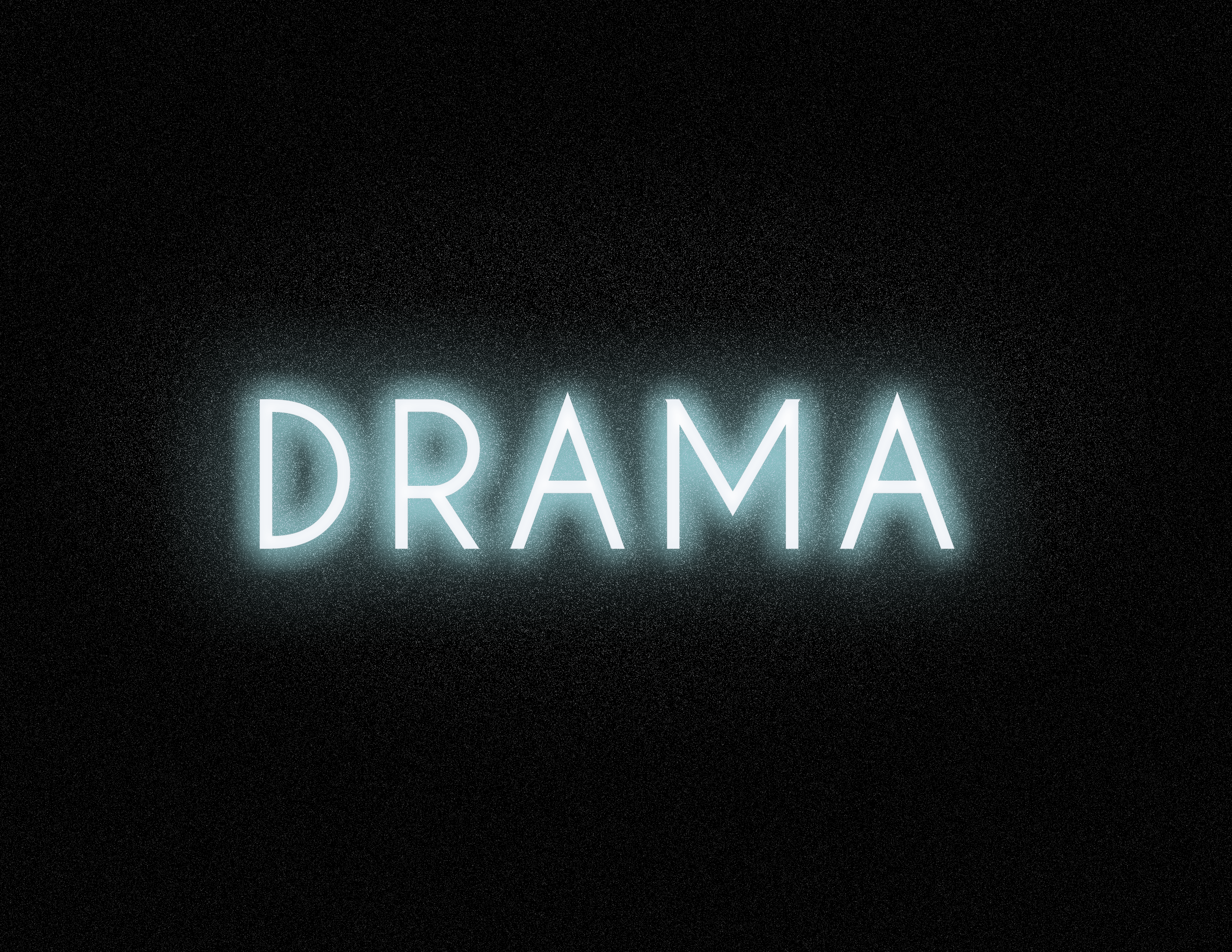
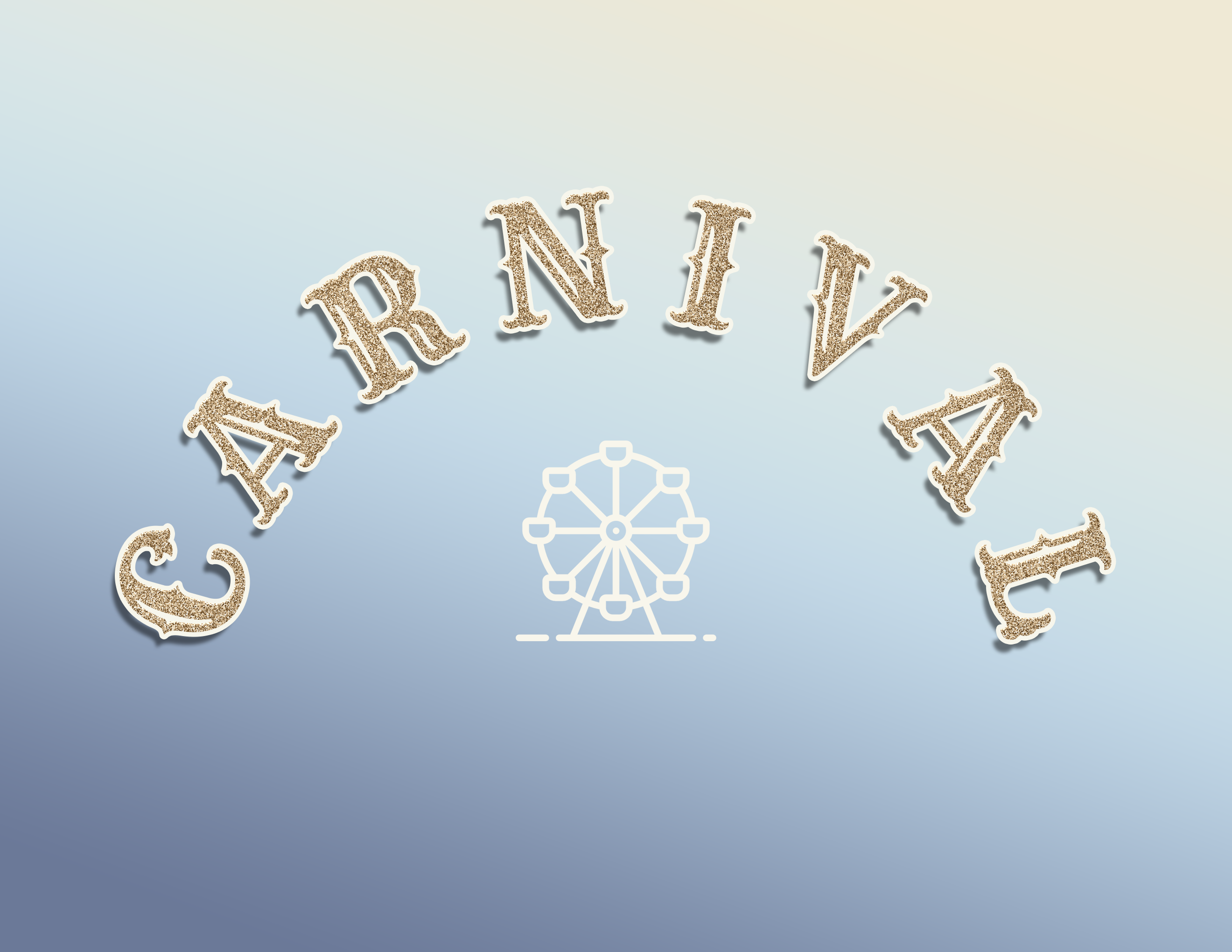

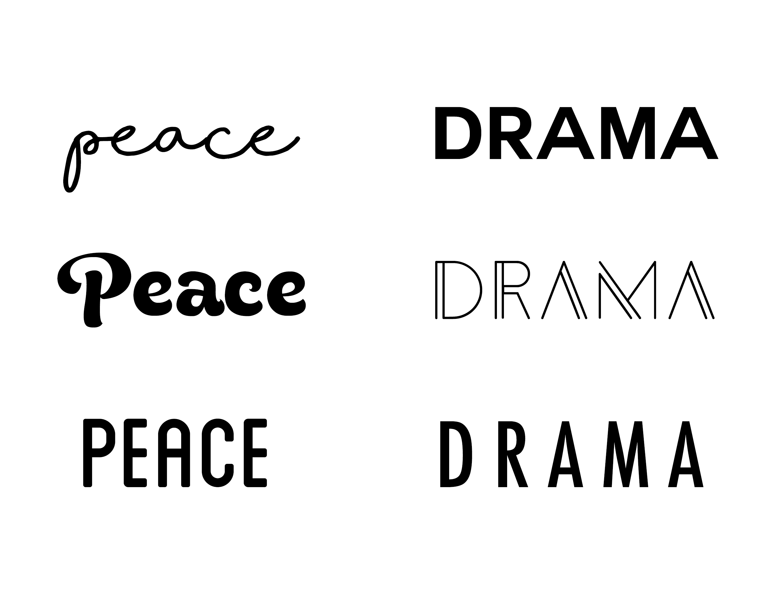

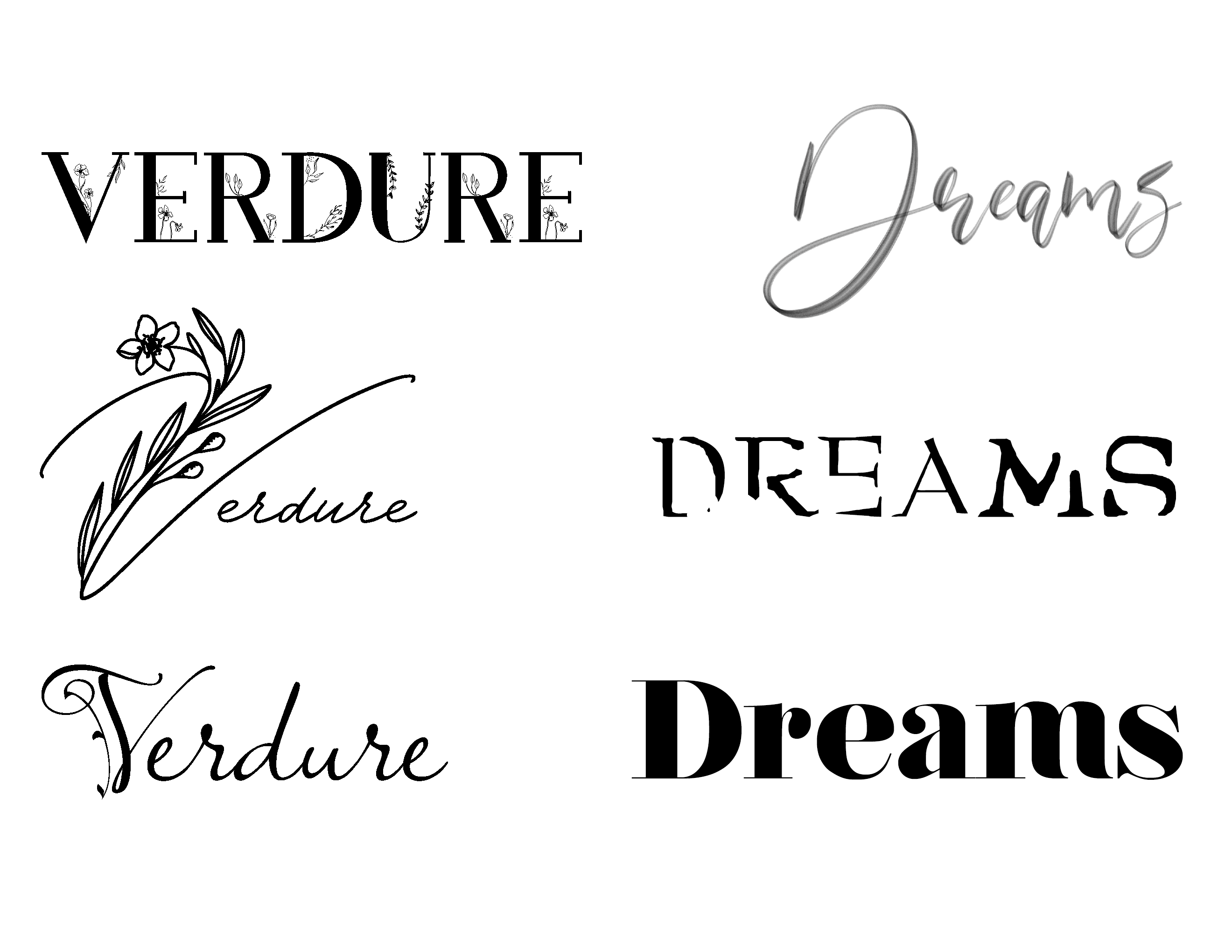
For these mood/font demos, I first selected six nouns – peace, drama, horror, carnival, verdure, and dreams. Then I researched various fonts that I associated with the respective nouns. For example, I wanted “peace” to have a more retro 70s feel, and I felt “horror” should have a slasher film type look. I chose 3 fonts for each noun and compiled them. As extra practice, I also created more graphic-design inspired variations for drama, carnival, and dreams.
Type Specimen Poster

Next, I created a type specimen poster. I chose the font “Bodoni” as I think it is elegant and I’ve used it in prior design work before. Researching and discovering the history of the font was fascinating. It’s illuminating to realize that each font has its own story. I sought to indicate a sense of old paper, since Bodoni is an eighteenth century font and I thought it would be interesting to visually display that. Then I added the word “Bodoni” in varying opacities to add a touch of modernity, as Bodoni is still widely used today.
Latha Luxuries Business Identity System

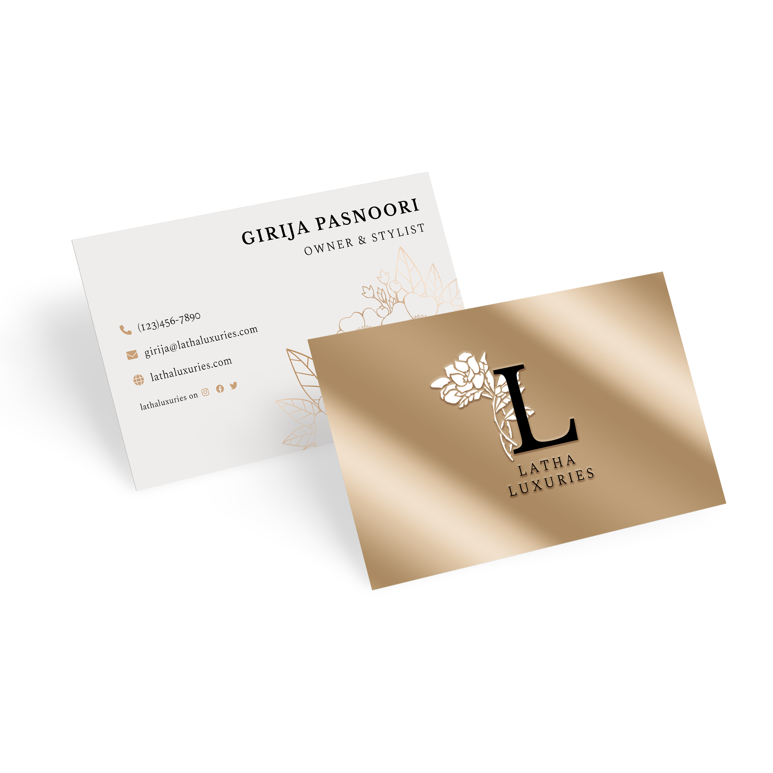

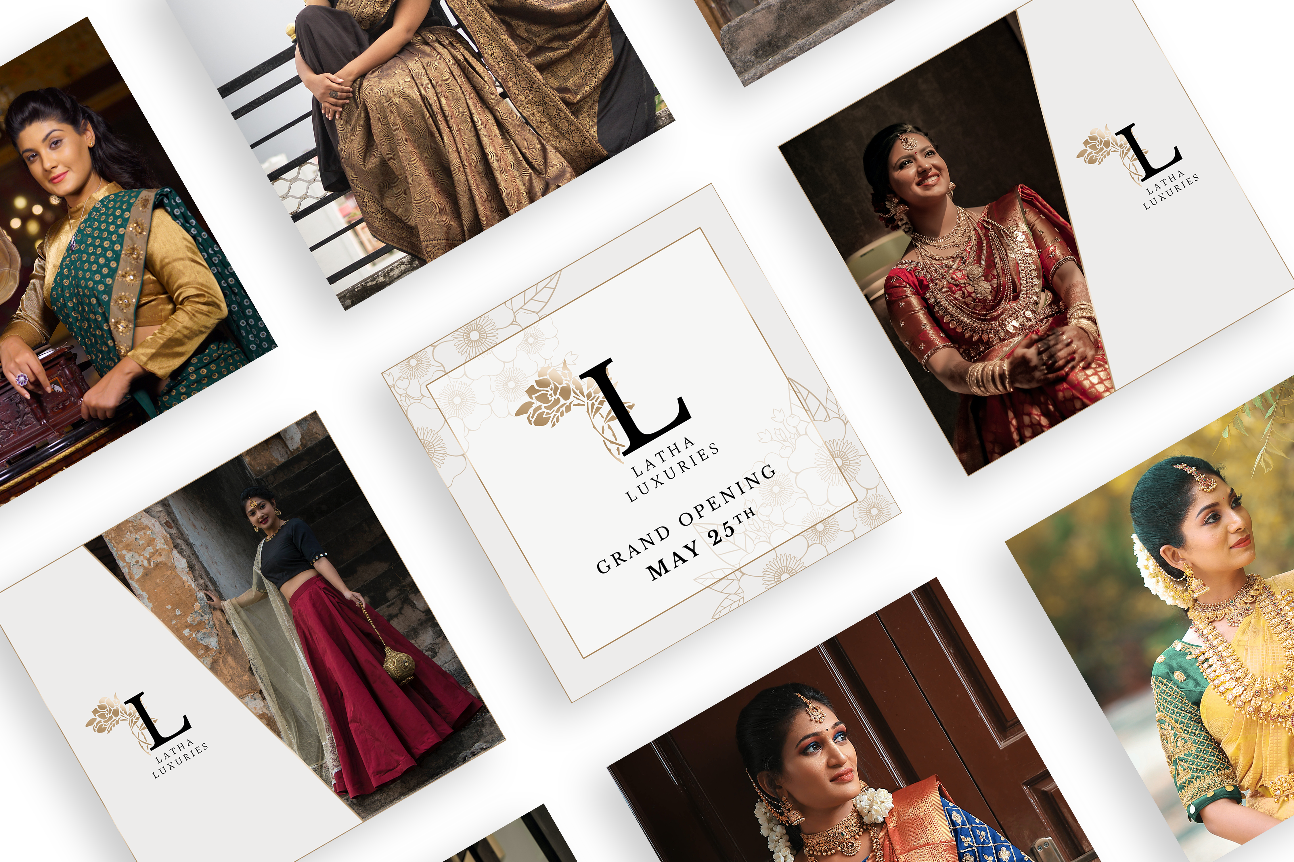
Finally, I designed a brand identity system for Latha Luxuries, which I had already created a brand plan for previously. I created a shopping bag, shopping box, packaging, business card, and Instagram promotional posts. I enjoyed making these materials because they allowed me to use type and the branding I made prior in creative ways.
