It goes without saying that images are vital to graphic design. Being able to effectively use imagery enhances a designer’s ability to communicate their intended message to their audience through their work. I explored how to use properly images in this exercise by creating photo boards, a tri-fold brochure, and a series of packaging labels.
Photo Boards
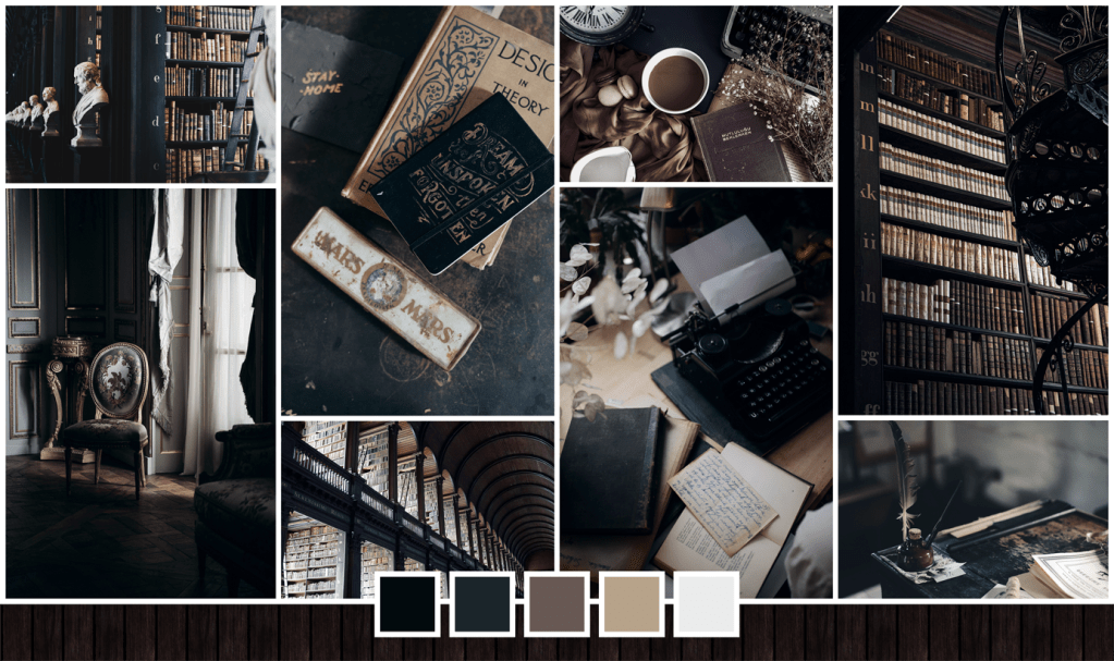


For my first experimentation with imagery, I created three photo boards. I first chose three establishments – a library, a clothing boutique, and a café. Then I trawled through image resource hubs such as Pexels and Unsplash to find the images I thought best fit the aesthetic I was going for. After I found a variety of images, I arranged them in a masonry grid format and added corresponding color palettes to each.
Tri-Fold Brochure
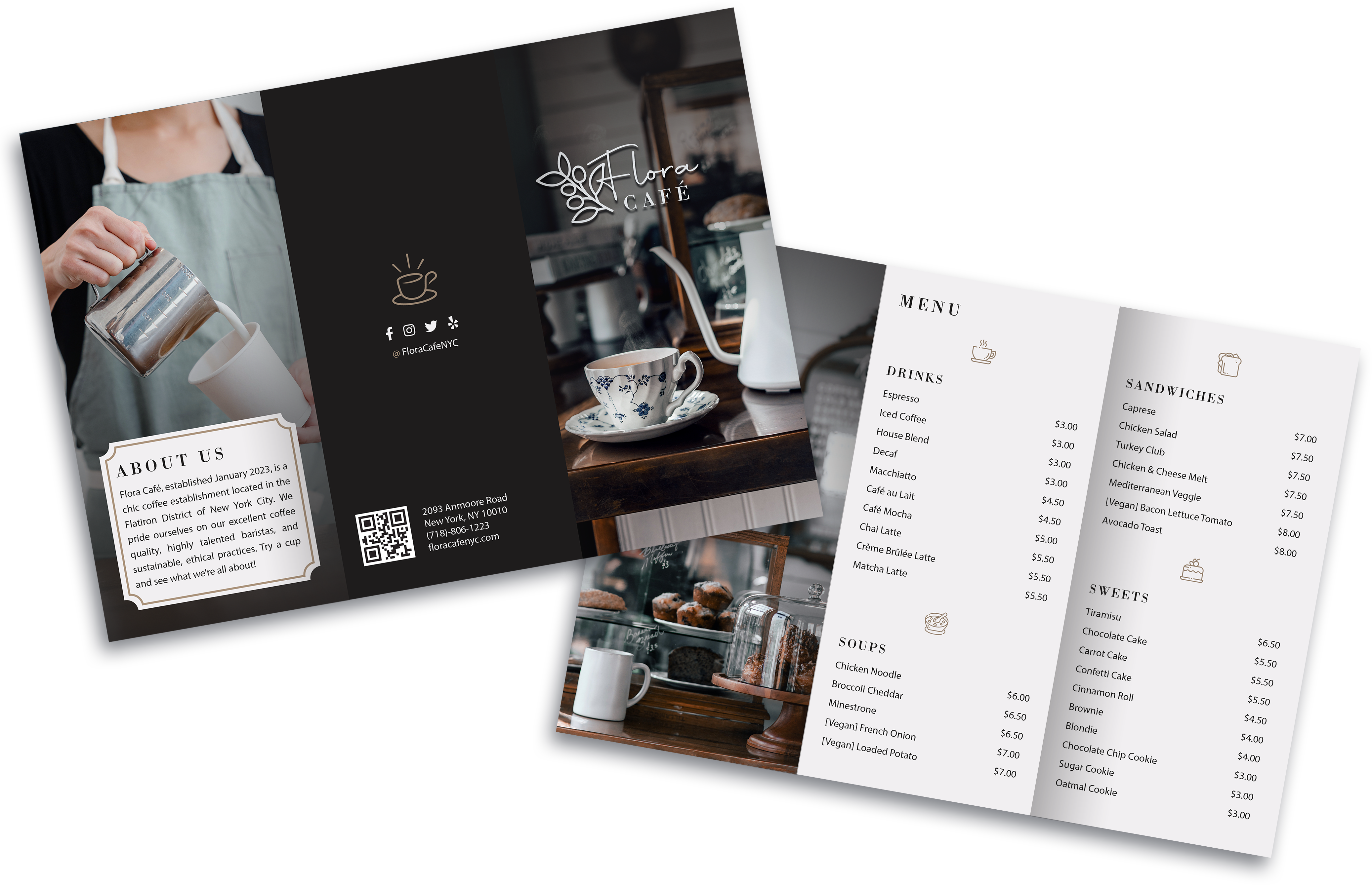
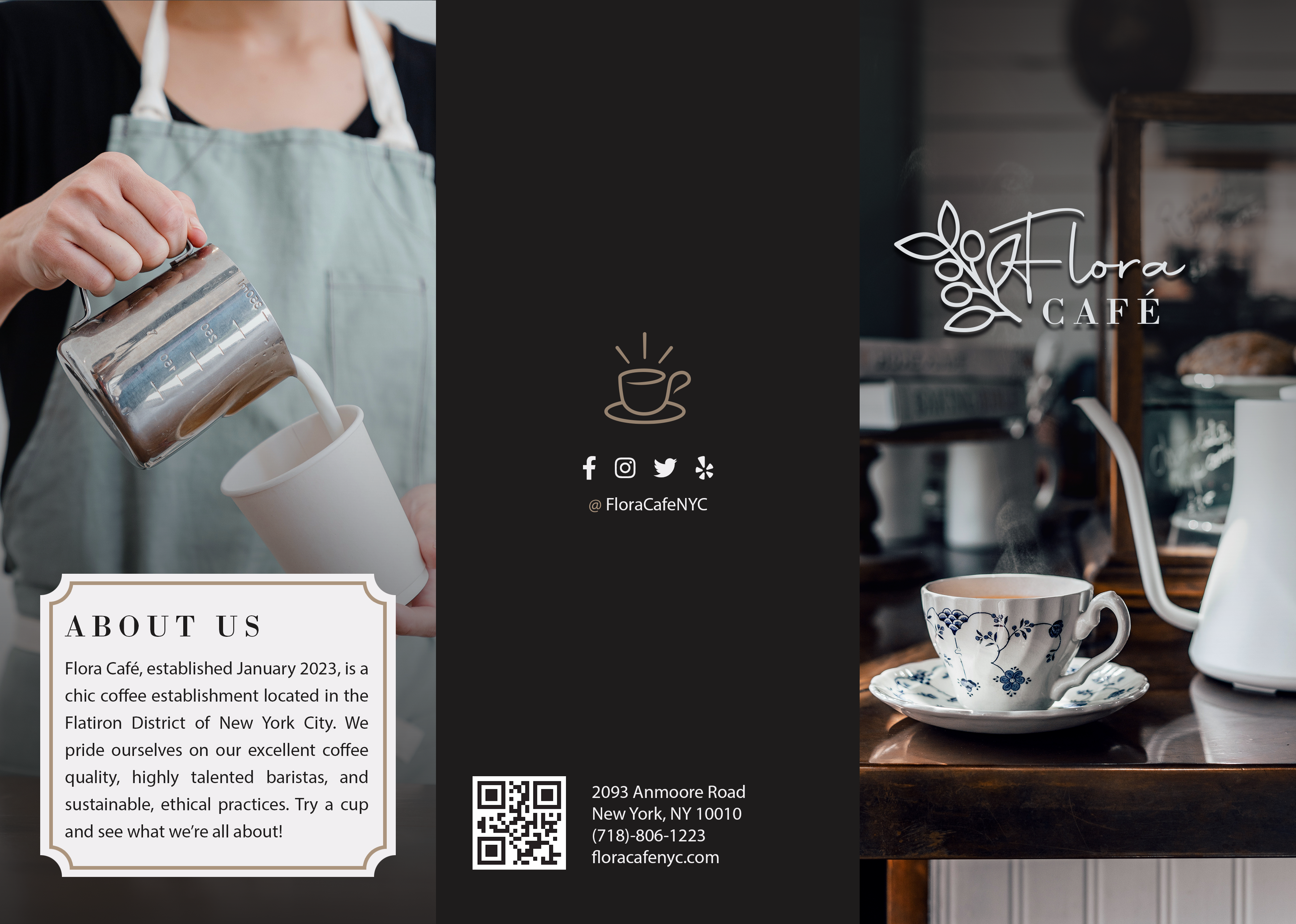

In my next experiment, I took inspiration from the photo boards I had created previously, and made a tri-fold brochure for an imaginary café in NYC. I carried over the aesthetic style from the photo board – elegant and understated, with calming blues and warm caramel/wood tones. I also selected minimalist iconography that played well with the images.
Packaging Labels
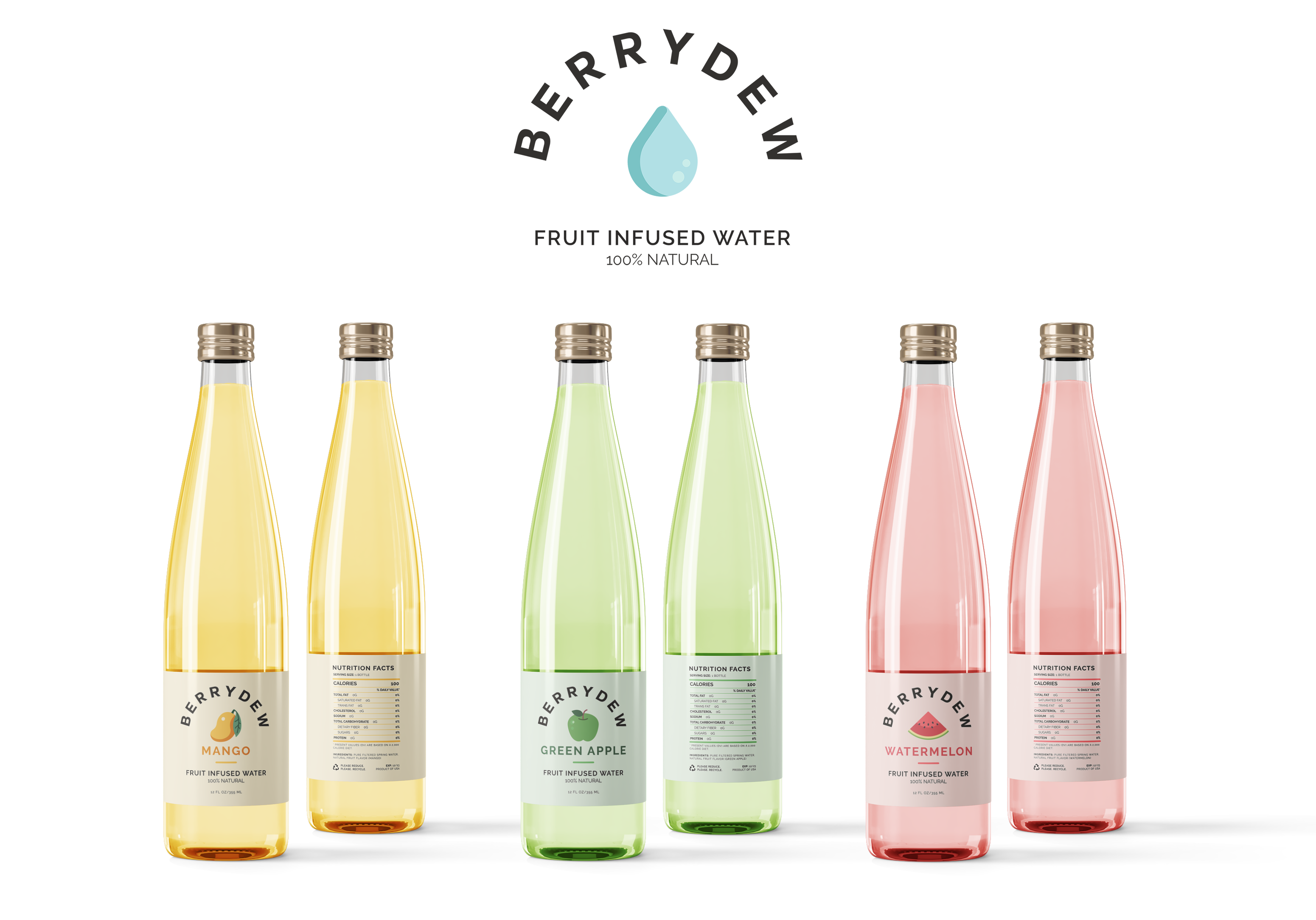
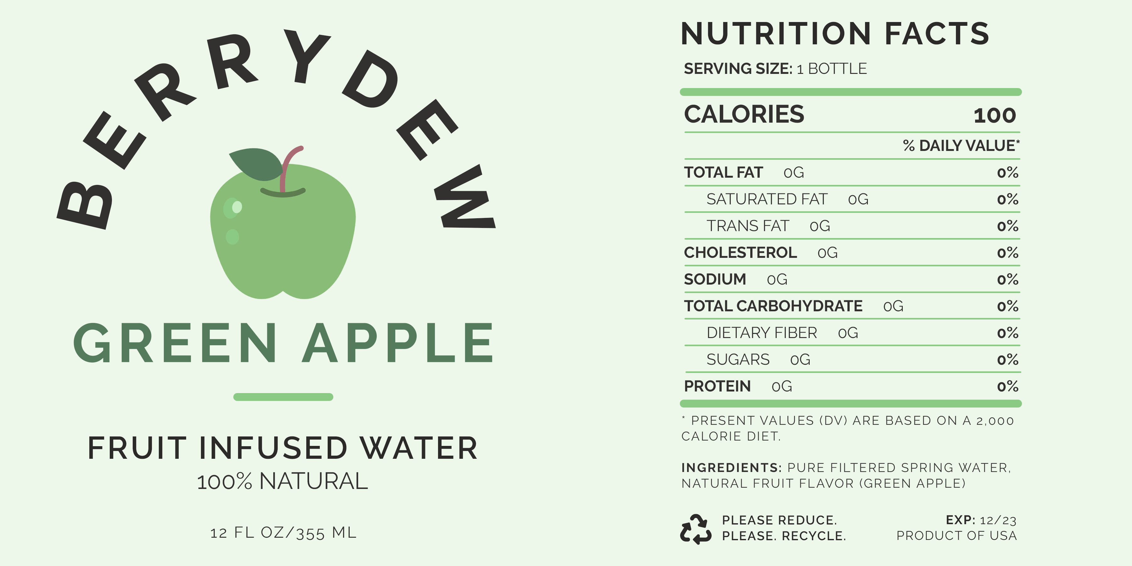

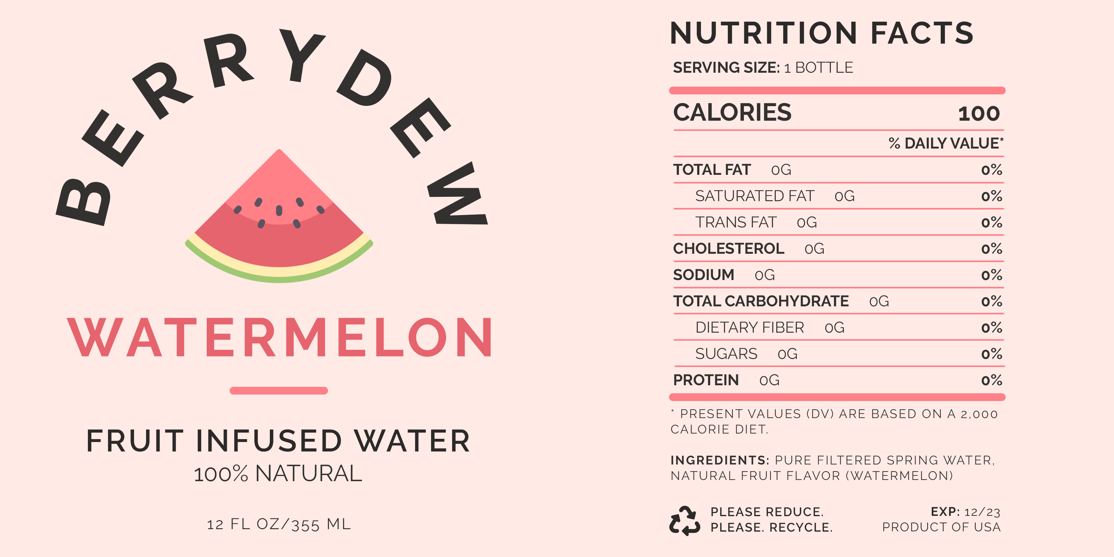
Lastly, I designed a series of packaging labels for fruit infused water by the imaginary brand – Berrydew. I played off of the colors of the fruit clipart illustrations and kept everything else simple and clean. I also wanted the hue of the water to indicate the flavor of the water (going back to my previous exercise with color), so I chose appetizing pastel sherbet shades. To add a little bit more extra pizazz, I changed the color of the water bottle caps to a light champagne gold.
