Goodreads is a website I use quite often. Since one of my hobbies is reading, I use the site to keep track of my books. However, I find that the site itself is not very user friendly and is sometimes cumbersome to use. So, in this exercise, I proposed some usability enhancements through a redesign.
Website
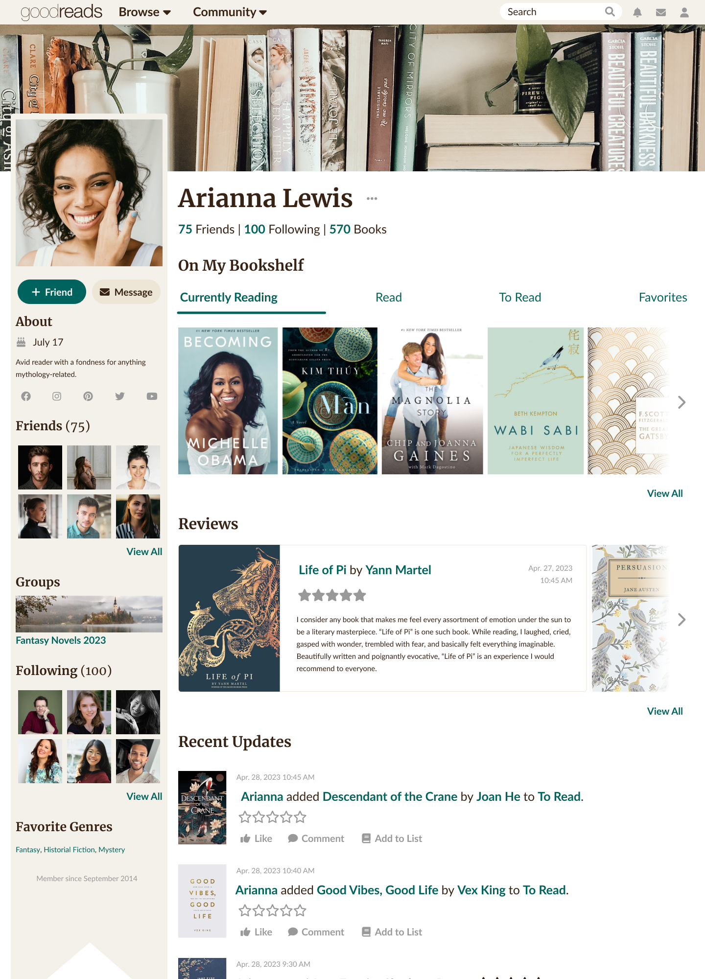

For the website redesign, I used already existing Goodreads brand standards – fonts, colors, and iconographs – and made sure the everything was standardized. I noticed that styling on individual pages was vastly different and there were many discrepancies, especially when comparing the profile page with a book page. Having inconsistent styles can cause confusion amongst the user base. Thus, I sought to amend that and make everything uniform.
Newsletter
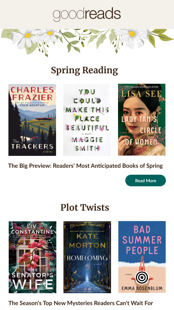
The Goodreads Newsletter was already well designed with well spaced text and appropriate imagery. However, I wanted more attention to be on the books rather than clipart, so I used solely the graphics of the books for each section, and then appended a simple flower clipart to the header and footer to signify the main subject of the newsletter – Spring.
