ConnectiCon is a pop culture convention that takes place in Connecticut yearly. Though I never attended, many of my friends have gone and said it’s a great time. In this exercise, I redesigned ConnectiCon’s branding and created a variety of promotional materials – a poster, a flyer, a t-shirt, a VIP badge, and Facebook/Instagram posts.
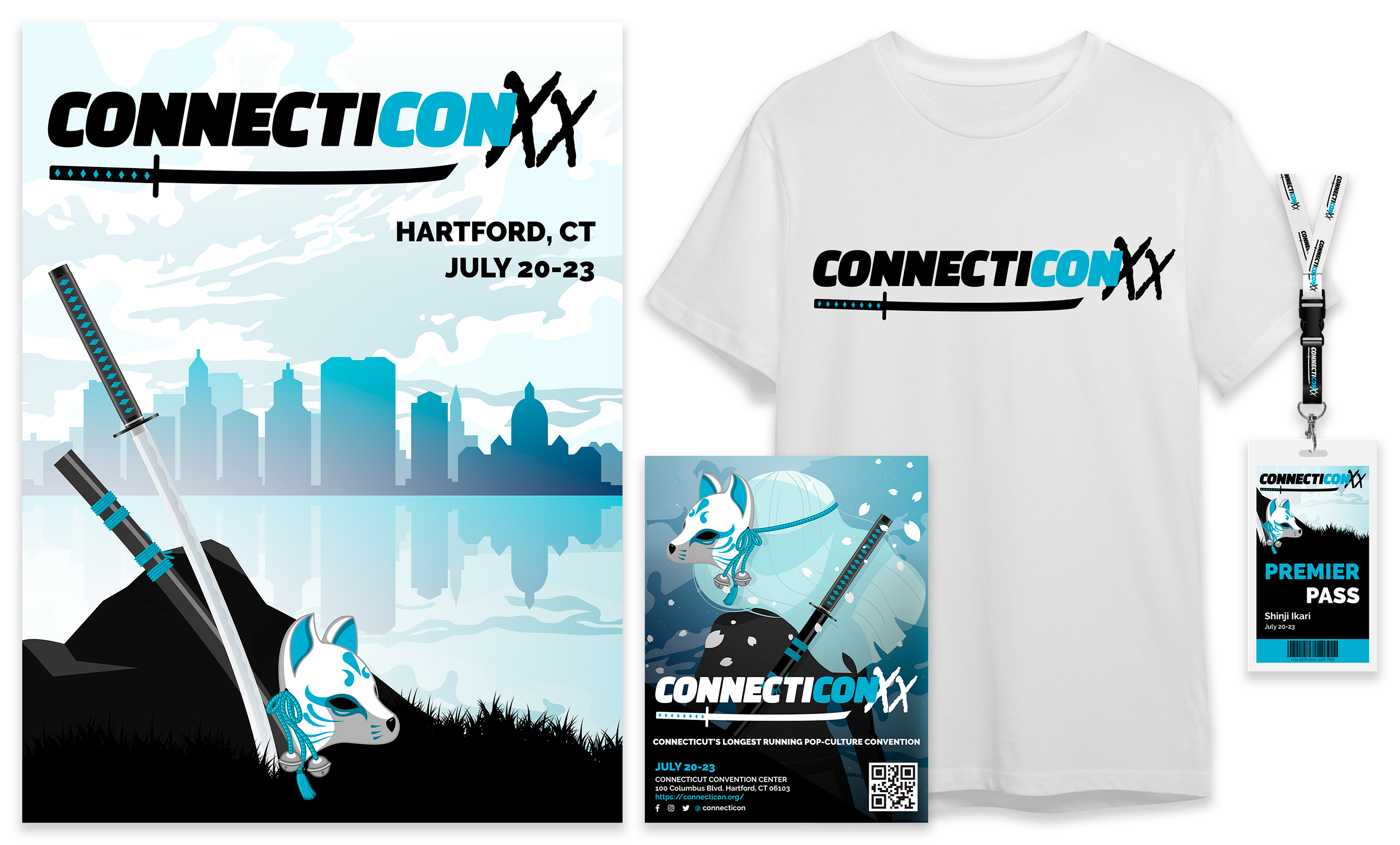
For the printed materials, I took the time to really nail the design before I went ahead with the social media posts. Since many fans of Japanese anime and manga attend this convention, I took that as my main inspiration and moved forward. I chose a katana and kitsune (fox) mask to be my motifs, set against the Hartford skyline, and designed around those. I also incorporated dynamic fonts, inspired by the clean but striking branding of big conventions such as Anime Expo and Anime NYC. I selected black, white, and blue as my main color scheme.

For the Facebook page branding, I made a page header using the Hartford skyline graphics. For the featured post, I noticed on the official ConnectiCon website that they were hosting an FMV contest, so I redesigned the graphic they already had to fit the aesthetic of my design.
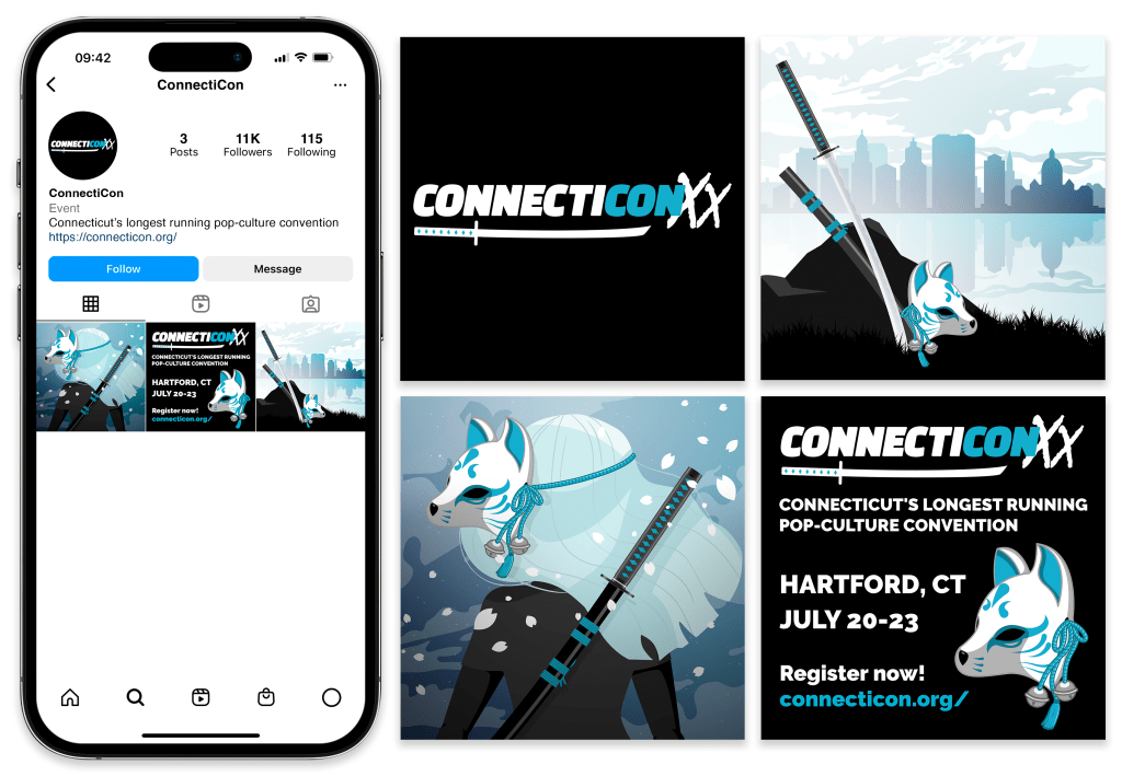
For the Instagram page, I modified the graphics I made for the poster and flyer into two square Instagram posts, and then added a minimal informational post in between the two.
