Color holds major significance in cultures around the world, in human psychology, and in many other ways. Its impact in design work is apparent and shouldn’t be overlooked. In this exploration of color with regards to graphic design, I created a series of Milton Glaser illustrations, as well as a series of multi-colored event posters.
Milton Glaser Illustrations
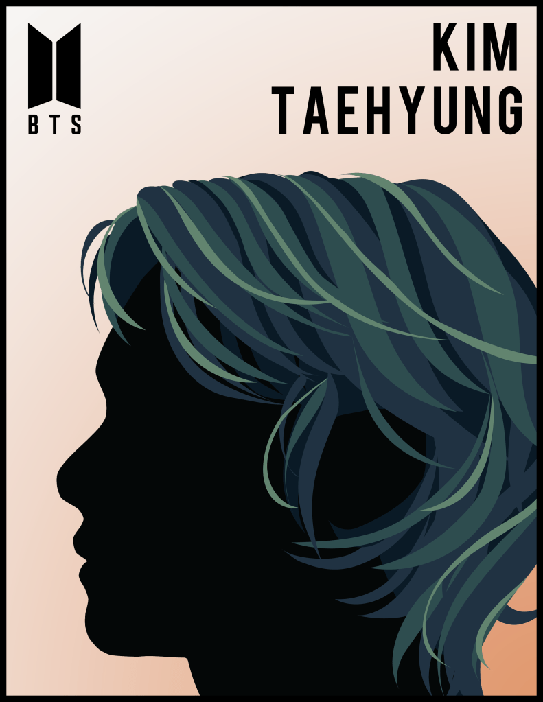
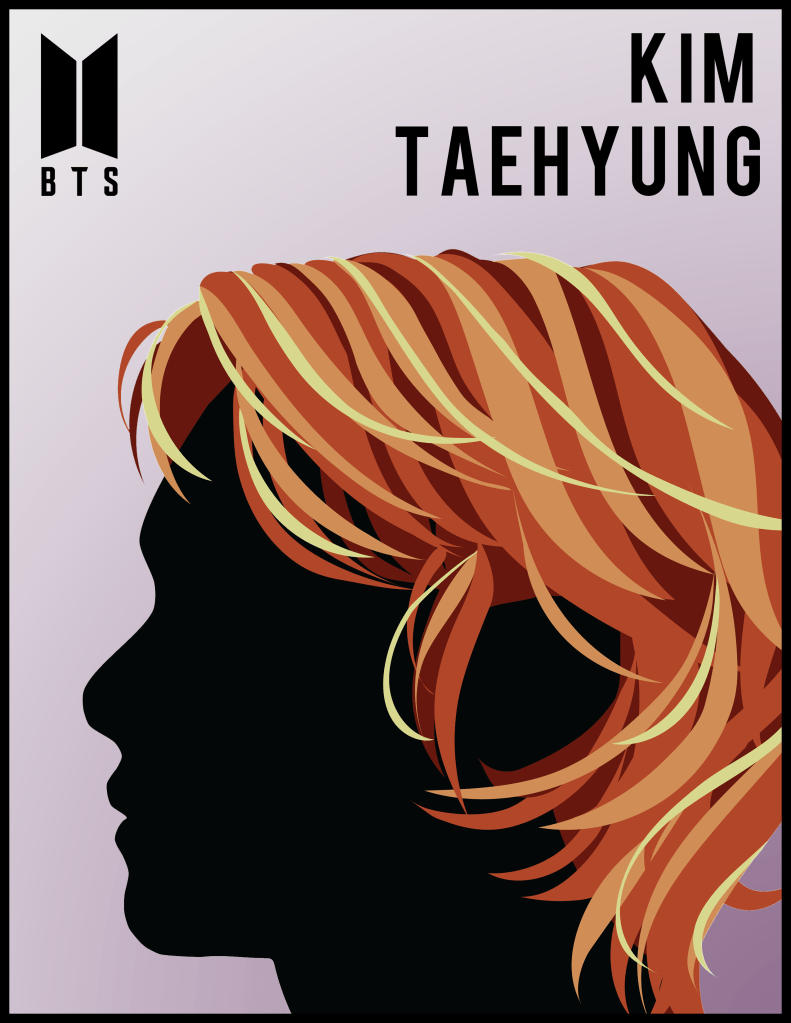
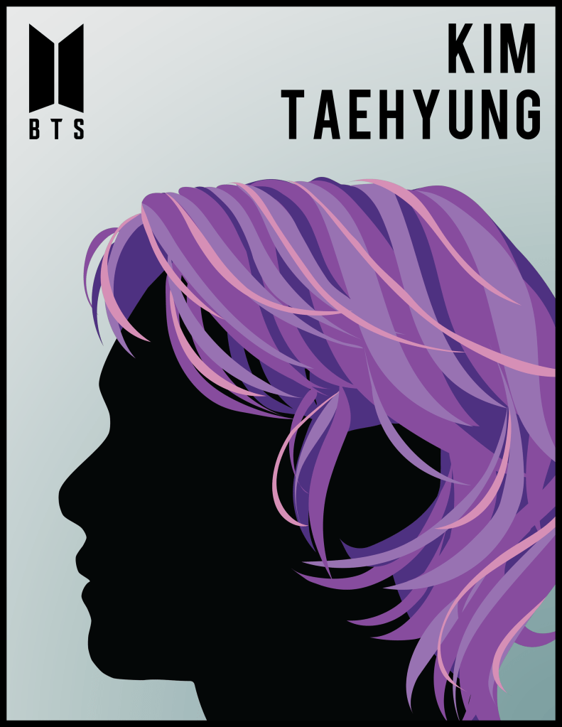
Milton Glaser was an American graphic designer famous for his illustrated posters and album covers. His distinct style of a side-profile face silhouette with whimsically designed and colorful hair has been featured in many publications. I chose to recreate that style myself. I selected Kim Taehyung, member of the internationally famous Korean pop group – BTS, as the main subject. For his hair, I was inspired by the elements – air, fire, and electricity, so I curated palettes suitable for each. In addition, I wanted the backgrounds to provide proper contrast, as well as provide a sense of cohesion and composition, so I added a gradient effect of complementary color.
Event Posters


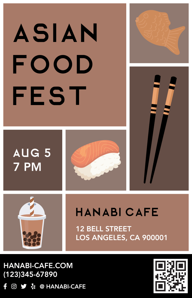
Another color exploration was to create three variations of the same event poster. I made up an imaginary event at and imaginary café for this, and used a fun, almost pop art style for the general layout. Since I was working with food, I wanted the colors to stimulate the appetite. According to color psychology, colors such as purple and blue suppress the appetite, whereas browns, reds, oranges, and yellows whet it. Thus, those are the color schemes I decided on and went with.
